Showing posts with label tests. Show all posts

Tuesday, May 16, 2017

Vitreous Paint Experiments (Malachite)

I bought a small bag of malachite chips to grind into pigment, to go into the William/Isolde scribal gift box. As I was having fun smashing it, it occurred to me that we do have greenish pigments, and I wondered if malachite might not compose one.

So, I smashed it and smashed it until I got cramping fingers and crossed eyes (Actually, not that long or difficult). I got out my handy 325 mesh sifter, as in theory that's the level Reusche grinds to, and sifted the malachite until I had a handy stash in an old spice bottle.


Because I am for scientific experimentation, I wanted to control everything except one variable. I used some Reusche clear glaze base so I could see what the malachite would do on it's own. I realize, I don't know the ratio of glass (or glass components) to oxides in pigments; One period text would say 2 parts glass to one part copper. I made four test chips to compare different ratios, 1:1 through 1:4.


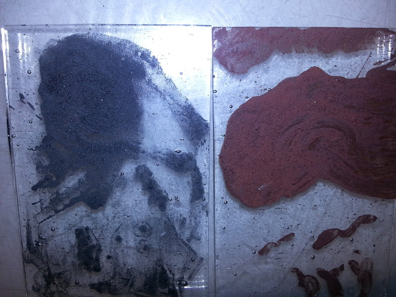
I mixed them on an ad hoc glass palette with a muller. The muller, being glass, seemed the easiest to clean. I noticed how easily the pigment mixed, much like working with commercial (Reusche, Fusemaster, etc) paints and stains. The very fine mesh size seems to promote fluidity. I used a bit more water than I would for "real" but with this small quantity of paint it was rather difficult to get the right water content (I guess I could have tried to drip it off an eyelash or a cat's whisker, but neither myself nor Zod were willing to cooperate with that). The water won't change the performance of the paint, only how it handles on the brush, so having too much water shouldn't impact the results.


I weighed them on my mini digital scale to get the ratios. Although it does .1g increments, the floor seems to be .2 grams. That was what I used as a "unit", so the 1:1 chip is .2 grams of malachite to .2 grams of clear base. The 1:4 is .2 grams of clear base, and .8 grams of malachite. I wrote my name on the chips, for some reason the first thing that entered my head, to test the line work. I then smeared paint on the bottom block of each chip to show various values. I also marked the ratio at the top.

I then fired the chips on my standard vitreous paint schedule, which matches the range for the clear glaze base. The next morning I was fascinated to see significant change in pigment. What I was aiming for was something akin to "Grey green" pigment, a modern sample of which is here placed next to the chips:


The malachite DEFINITELY darkened. To my eye, it also seems more faintly blue than green. Azurite, a deep blue twin of malachite (both are copper (II) carbonate rocks) will turn into malachite when weathered, but nothing in my research shows the reverse. I did find that azurite when heated turns into copper (II) oxide, a black powder. That oxide is then used as a ceramic pigment, making blue as well as green, black, pink, red, and gray colors. I suspect that's what has come into play here, the malachite likely also forms the oxide which would account for the blueish hint and the darker color. I am not a chemist, however, and I couldn't easily find a reference to what happens when you heat malachite. [Edit: A friend reposted my link to get the attention of some chemistry-buff friends, and one Liz pointed me at this link. Malachite does turn into copper (II) oxide.]


I first picked up the 1:4 chip, and immediately noticed the paint flaking off onto my fingers. My fingertips were tinged grey/black/blue. I found, using a wooden skewer, that the 1:3 chip was also very easy to scratch paint from. The 1:2 I could leave some trace, but not much. The 1:1 completely resisted the stick like Reusche paints would. Looking at the reflected light, the 1:1 chip also looked much like a dozen other test chips I've made; the paint is completely glassy and adhered to the test chip. I fire my vitreous paints to the high end for that effect, so this is expected. The other three showed a rough, grainy texture I associate with previous experiments that had too rough an oxide.


Lessons Learned:

  • Yes, a randomly selected mineral MIGHT make a usable vitreous paint!
  • Something near a 1:1 ratio is probably idea to bind the pigment to the glass, though 1:2 was also serviceable. My tests of the period formulas are 1:2, and were very similar.
  • It would be wonderful to find out what actually goes into Clear Glaze. My normal secret trick is to check the EU vendors, who seem to list MSDS's that US vendors do not. Unfortunately Peli doesn't include one for Clear Glaze. Reusche gives them out if you make a special request in writing, whereas Peli just has them on their website. I rather suspect this is because the MSDS sheets rather give away the secrets. 


Monday, March 27, 2017

Glass and Gold and Gilding

I've signed up for a couple of mosaic classes in April and May. It reminded me I wanted to try my hand at making Byzantine-style tesserae, and then a friend's Facebook post kicked me into high gear. She had much better success than I did and shared some of her wisdom. My test piece:

Two pieces of clear fusible (Bullseye CoE 90 Tekta clear) with one layer of gold foil sandwiched

Rhode Kephalaina let me know in her sample chips, marked 1 and 2, thats the sheets of foil. So, chip '1' has four layers approximately, and '2' with 8. My samples above are 4" square, not 1", and had one layer. It's not exactly ugly! It's just not the beautiful gold glass expected. The nicer parts of mine are where the foil doubled on itself (see Lessons learned, below...) I know now to fix it, though, thanks to a conversation with Rhode.

Ive also fallen for verre églomisé. Predating Rome, pretty much, this art (gilding glass and painting the back black) was practiced through the Roman period into modernity. It gets its name from an art collector 200 years named Glomy. It turns out it's not super difficult!


Sorry it's sideways. I can't quite remember how the technique entered my awareness, either through researching mosaics or mirroring. A little gelatin, some gold leaf, and some glass. A fine needle to scratch it up, and black paint. I'm going to teach a class on it at Pennsic this summer, which is exciting to me. I've tried a few types of leaf, a few tools to transfer it to the size, and will be picking up a second (larger) gilder's tip this week. It's beautiful to look at and I'm excited to see how I can integrate it into stained glass and mosaic work.

Probably To Be Continued...

Lessons Learned:

  • Transfer foil is a lot better to work with for verre églomisé.
  • Tiny creases are almost unavoidable with loose leaf, but the gelatin size flattens them out as it dries. The end result isn't perfect but it is much better than what you start with.
  • TURN OFF YOUR CEILING FAN. Many people remark that gilding can be done at your kitchen table, and they are quite right. But when you bought a book of loose gold leaf and have the fan on medium, you are going to make a kaleidoscope of tears and gold for a moment. 
  • Making Roman Gold, as Rhode is trying, or Byzantine Tesserae as I am, costs a bit! The leaf is not terribly cheap, though you can find it reasonably. She speculates gold foil, not leaf, would work better but it runs $75/5 sheets. 
  • Don't use imitation gold. I did this before a year or two ago, without entirely realizing. It was an aluminum-based product, I believe. It turned horrible colors and crinkled up under the glass. 
  • I wondered at using silver to do this. I'm told it can work, but my experience with silver stain says it certainly cannot. Ken Leap's book shows an example of firing a piece of solid leaf, and it made a dark amber stain at just slightly higher temperatures than I use to fuse. Further, I've used ground silver leaf in a period formula at much lower temperatures, and it made a light lemon yellow. I'd think 'silver' would necessarily be platinum leaf, which I have not priced or looked at.


Friday, February 3, 2017

Silver Stain Experiments Part 2

[Edit: No idea what this is still a draft. Publishing now, three years later!]

Phase 2 has actually turned up some successful blends!

Detailed below are tests I ran with pure silver, silver nitrate, copper sulfate, and silver sulfate as the active compounds. Binders included a new, "brand name" red ochre, yellow ochre, gum arabic, and brick dust. After doing a round of tests I came up with several new ideas, particularly where pure silver and copper sulfate are used, and had to do another set.

Some notes on the binders themselves:

Silver dust and gum arabic - Almost indistinguishable from pure silver dust. Film formed, gum arabic undoubtedly. Weird to see it plainly, but interesting to get a clear visual of the effects of gum arabic. I've noticed recently, when I added too much water to some matting paint, how there is a "thickness" to the water, as you stir the paint you can see some of the unmixed water jiggle and repel the paint until you force it to mix. I've not tried mixing paint with no gum arabic but I think I'll try it to confirm my thought that that is also the GA (rather than the paint). That may be what they refer to as "body" when talking about other binders mixed with water.

Brick dust - Probably needs to be even finer. Works well. I ground pot shards with a pestle and mortar, but I think I need to get it even finer. I'd love to get my hands on a ball mill to do this, but it's not in any shape period.

And a correction from "Part 1" in that I realized I'm slightly blind. As I began to tag and catalog my samples, I almost threw out a few pieces that didn't take. As I was getting ready to toss them I realized that the copper sulfate chip DID stain:

On two slides it's almost imperceptible (this picture above is not a very good example, but it shows up at least) but it was actually there. Because of this realization I tried a stronger mix of copper sulfate for this round. As detailed below in Sample 6 it didn't work out, but I have a good idea why not (temperature).


The stain samples prepared and drying:


A closer shot of the samples:


Silver nitrate and gum arabic made an incredibly pretty, deep orange color while drying. This continued to intensify as it dried, becoming a dark red


The samples after firing:

Sample 1 - Pure silver dust and gum arabic (1:6). Oddly enough, this did nothing. I suspect it takes a higher temperature to work. I know from Leap's book that pure silver leaf will leave a dark amber stain on glass, I can't imagine the powder not having the same effect. Later review of Leap's book indicated he fired his pure-silver tests at 1500°, a full 500° hotter than I did. I know what to try next, and may throw some more of sample 6 in with it.

Sample 2 - Silver nitrate and red ochre (this time from Vallejo pigments). Clear proof that there was an issue with the red ochre I bought before, this name brand sample didn't have the same hazy effect that the first sample left behind, ruining what results there might have been. Part of the sample is a little darker, but I suspect that may be related to how I used it (no blending, possibly imperfectly even surface allowing oxygen to get in, etc) rather than the mix. I consider this one a success!

Sample 3 - Silver nitrate and terracotta dust. A bit of research indicated most of the bricks before the 14th century would have been very similar to what we call terracotta. I bought a small planting pot, smashed it, and started grinding it into a powder. It seems to work quite well, actually. The one downside was that it must be ground very finely. Small "pinholes" are visible in the sample (close-up later in the post). This was caused by less well ground (larger) bits of the terracotta that inhibited the even spread of the silver nitrate. This also left behind a bit of hazing on the edge, but I again suspect it has to do with handling rather than the compound. I also consider this one a success.

Sample 4 - Silver nitrate and gum arabic. Oddly, this didn't work at all. No effect was left behind. Isenberg's book has a chapter on painting and a page on silver stain. It mentions that the "Reddish material" has minerals which pull the sodium out of the glass and allow the silver in. I find it hard to believe, but at the moment have no other explanation for this chip's complete lack of stain. The silver sulfate and copper sulfate chips, both mixed with gum arabic, had visible staining. Silver nitrate did not. The same book also states that "other silver salts" (presumably silver sulfate) are added to stain powders because nitrate is unpredictable and melts unevenly. I haven't seen that to be the case, yet, either.

Sample 5 - Silver nitrate and yellow ochre (vallejo). This mixture was twice as strong as the same combination I tested in "phase 1" and likewise is a much stronger color. This is 1 part silver nitrate to 3 parts ochre.

Sample 6 - Copper sulfate and gum arabic - This is a 1:6 strength mixture, better than what I had previously made. I discovered, just before pitching the last test chip, that copper sulfate actually had stained the glass. The compound was in such a small quantity that it was in the form of tiny specks. I mixed this more strongly and used more of it to try and get a more visible effect. I didn't get it, though again I got visible effects. I think this merits a higher temperature or longer soaking period.

Sample 7 - Silver dust and gum arabic, 1500°
Sample 8 - Silver foil pure, 1500°
Sample 9 - Copper sulfate and gum arabic, 1500°


A close-up of sample 5


 A close-up of sample 3


All 13 test chips I've fired so far

Lesson's Learned

Future Plans ("Phase 3")

Monday, February 15, 2016

Period Vitreous Paints, pt 1: Oops, this worked?

"...using for this ground scales of iron and of another rust found in iron pits, which is red, or else hard red haematitefinely ground, and with these pigments he shades the flesh, using alternately black and red, according to need." - Vasari (Dover translation p. 269)

"...and he gives you a color which he makes from well-ground copper filings;" -Cennini (Dover translation p. 111)

"Take copper that has been beaten thin and burn it in a small iron pan, until it has all fallen into a powder. Then take pieces of green glass and Byzantine blue glass and grind them separately between porphyry stones. Mix these three together in such a waythat there is one third of [copper] powder, one third of green, and one third of blue. Then grind them on the same stone very carefully with wine or urine, put them in an iron or lead pot, and with the greatest care paint the glass following the lines on the board." - Theophilus (Dover translation, p, 63)

Since I've made all but one of the period silver stain formulas I have found, I've decided to try and make vitreous paint. I started by building a frit smasher; it's not the period way to grind glass but it is infinitely easier for some initial tests.

Vasari seems to suggest you just paint with metal dust. Cennini is less specific, but doesn't contradict that. Theophilus clarifies a mixture of metal filings and glass, one part to two..

Just as with my silver stain tests, where I started off with purchased silver salts, I used my frit smasher (aka a frit piston) to smash pieces of scrap clear glass from my scrap buckets. I originally thought that this would require making paints from the same glass you are going to paint on, but nothing in the primary sources suggests that. I've seen reference that say modern vitreous paints are more "glass fluxes" and oxides, rather than actual glass; the latter would seem to be more akin to an enamel as we define it modernly. In this case I specifically sought out pieces from at least two different original sheets to avoid accidentally lining up CoEs.

Scrap glass pieces. I ended up using about twice this. My left hand for scale.

After just a few minutes work, with occasionally shaking of the pile to mix it up for better smashing

For those who don't do much with warm or hot glass, the Coefficient of Expansion relates to how quickly the warming or cooling glass expands or contracts. If you try to use two pieces of glass with incompatible CoEs, they will separate, usually fatally and sometimes explosively. I've generally seen a safe range being only one point in either direction (the common CoEs are 90 and 96 for fusible glass, with 103 also being common to lampworkers making beads. Borosilicate glass/Pyrex used by some lampworkers is CoE 33.) The bulbs I use for my ornaments class are COE 89; we use CoE 90 frit with them with no problem, but 96 is right out.

I rather expected the CoE would be a problem, and would spall or destroy the test chip. I used my frit smasher and generated a mess of pebbles and dust. Lacking anything more specific for filtering, I rolled the material in a piece of cheesecloth to get a grainy powder into a bowl.

Do not inhale this!

I ended up with a wooden bowl of rough clear glass powder. I turned to two purchased bags of metal filings, one iron and one copper. Bother are already a very very fine powder. I scooped a little of each into small wooden bowls using a palette knife, and added a similar amount of glass powder. As I stirred I worried there wouldn't be enough glass to "bind" the metal, and I added more of my clear powder. I ended up, accidentally, with approximately the ratio Theophilus called for. I did some cursory grinding on the palette, but it really didn't help. Testing it with a sable brush showed poor adhesion to the hairs, and the paint that left the brush was fairly poor, very weak with the copper-based batch. The iron batch was much better. As both metals are finely powdered I think I found a better portion of the powder bowl to draw from by luck.

Next go around, I will try to grind them up on porphyry, as period sources call for. I have been confused from time to time on what that means. Over Facebook THL Ian the Green gave me some clearer details from C&I pigment creation. He referenced this video, suggesting the technique at 6:29 and after 8:00 would be helpful. I will try and follow these next.

I placed them on some of my standard test chips, cut to size a binder full of test chips. Because it is glass powder and metal, I suspected that it would require a fairly high temperature to fire these paints; period sources definitely don't have the precise control we have, and in theory this strikes me as much more akin to glass fusing than normal paint firing. I used my standard cycle (which reaches 1250) and waited. And waited. And WAAAAITED.


The chips actually worked quite well. They didn't fire to the smooth and glossy shine of my modern Resuche paints, but they were opaque and well-adhered. I suspected, still, that they would be poorly fixed so I took the chips to my lightbox and hit them with a skewer I use for cleanup work. None of it scratched off.

The iron chip is "psychologically black" rather than optically black; When you see it, you know it's black. Your brain would remember it as black. It's actually fairly grey. The copper based pigment is a pretty color, but I would best describe it as somewhat like dried blood; It's lighter than bistre brown (which reminds me of old tree bark, it's a very dark color but not enough to be perceived as black) and it's a bit darker and more true than tracing brown, which to me has a reddish hint.

Overall, it was incredibly exciting to get working results with these very first attempts. I'm going to pursue more period steps immediately.

As an afterthought, I want to document something Master Avery shared on Facebook. I was totally unaware that you can reverse rust back into iron. The physical structure is destroyed, but the iron is recoverable. This is one way to get good, fine, filings; By using an oxidizer (and I will edit in what he offered, bleach I think) you can get the iron to rust. Then you can easily grind the rust. Putting it in charcoal and heating it appropriately will reverse the oxidation and leave iron. Very, very neat.


Lessons Learned/New Questions:
Holy cow, this worked.
It would work better if ground up more finely
     Use commercial powder/better sieved home made powder?
     Try the porphyry method
Does da Pisa have a recipe? Mappae Clavicula? The Bolognese manuscript? Have to check them...
I did very tiny batches, next time use my sandblasting mask to avoid any invisible dust inhalation.
How is color modulated? How is my modern tracing black so much darker? More iron? Or a darker mineral?
What will hematite look like? Pinkish, for sure, but...
What is Byzantine blue glass? A color, or a specific formula of glass? Byzantium is a purple...

Thursday, August 13, 2015

Pattern Shears

Going to try something new at my Laurel's suggestion to see if it makes me happier with my cutting accuracy. A lot of the super-precise artisans I've met online seem to use pattern shears, and she suggested it for me.

I hopped over to my local supplier and got a pair. The owner, an awesome woman, had me find them in a box under a cabinet because she hasn't had demand for them in years. The shears give a seriously big gap (and I triple checked they were foil, not lead not mosaic). For a few bucks I grabbed them anyway, but kept researching. I found shears that kept saying they removed 1/32" for foil. The pair I got locally can not be 1/32". I ordered a pair (made by Mika Intl, via Amazon, but this is not a plug). They DEFINITELY remove less pattern:

"Squeeze-bottle grip" foil scissors, left, Mika Intl shears, right.

I'm working on cutting up a pattern right now, planning on starting to cut it tonight. Lots of curves and difficult cuts, it should be a great test if this method works better for me than working "English" (glass on pattern on lightbox).


Monday, September 15, 2014

ODH Scroll for Baroness Zafirah

I describe myself as the worst scribe in the Midrealm. Frankly, I don't self-identify as a scribe at all. I don't work on any kind of C&I in my free time or for enjoyment. I started taking scroll assignments in my capacity as a herald to assist the scribes when a court list came out on short notice or was larger than normal. I've made 3 or 4 paper scrolls, unhappy with any of them, before deciding that I should try and make a glass scroll and play to a strength while getting the job done.

Still, I never take assignments above the AoA level, I leave those for the practicing scribes. So when Estelle, my good friend and our chief Signet messaged me on Facebook offering a Dragon's Heart assignment I balked. Twice. She was insistent, I'd really want this one. I finally agreed and was not disappointed. But that left me needing to figure out how to make a scroll worthy of our highest service award beneath a peerage, one going to another dear friend.

I started sketching ideas on my train ride and sent her a picture. She immediately liked one of the designs so I worked on making it into a full cartoon.

It can save a lot of frustration to make the most difficult cuts first, so I started on the heart. Slowly removed the "dip" in tiny cuts until I didn't dare press my luck further:


I painted on the lines with some fear. I've made one other Dragon's Heart (a suncatcher, not a scroll) and the green glass turned from a translucent Hunter's green to an opaque green with translucent mottled spots. I had one sheet of glass and it pretty much had to work for me to be done on time.


A sheet of lined paper from my previous scroll was sitting behind the lightbox, and it came in very handy with this. Once dry I did some stickwork to clean up the lines, and fired it overnight. I was intensely relieved when the glass came out looking as it had going in.

I was going to leave it alone there, as with the other heart, but I wanted to make it stand out more and thought of shading/highlighting schemes. I hastily mixed some paint, applied a mat, and tried several schemes for highlighting either the entire piece or the individual scales.


The left half is shading the entire heart (though not as gradually as I planned). The right half shows a stippled highlight, scrubbed highlight, a stickwork edge, and combinations.

I then decided this mat was a LOT heavier than I desired and redid it with something more like what I wanted in the "real" shading. My consulting scribe said she thought the scrubbed scale-by-scale highlight looked best so I did more of that on the test piece.


That being settled, I ground and remixed my paint better, and did the real thing. An observation about scrubbing is below.


The red and clear fill-in for the "inner circle" was easy and routine. I found a Spectrum Baroque sheet that had faint tan streaks and chose it for the calligraphy border for interest, rather than use more of the Foxtail sheet from the inner circle. This time I mixed up some water-based paint, after speaking with Kirsten about it, rather than the clove oil paint before. I tried the dip pen, but it fought me again. I finally tried a tiny brush from the local hobby shop, intended for painting Warhammer miniatures. I discovered that a pretty good technique could be gotten from it. A painting bridge was extremely important to this work. The calligraphy isn't great, but this time I've come away believing that with a bit of practice I could make some respectable lettering. The water-based paint made half the difference as well.

As always, click to see larger versions.


I was very unhappy with the way it looked foiled. The gaps were rather large. I suspect it's because I use photoshop to make my own patterns at times, and the lines are fuzzy. I think I'm sabotaging certain custom patterns right from the start by not having crisp cutting lines. I eventually quit trying to evenly space the pieces, and instead I pulled them closer to the center. This caused heavier lines and larger gaps between the heart and the calligraphy border, but at that point it looked symmetrical and pleasing to the eye, at least I felt so.

As the woman who taught me stained glass once remarked, "black [patina] hides all manner of sins" and once the roundel was completed I was much less upset with the finished product.


Lessons Learned
1) Water based paint
    After I made the Acorn scroll Kirsten mentioned she does her calligraphy with water-based paint for easier clean-up. I often remark that glass is a forgiving art for a shaky non-artist like myself because we can clean our lines up a fair bit. I don't have a before picture of the calligraphy for a reason, scribes would faint. I intend to use water-based paint to "calligle" going forward. I'm next going to try it with a "kistka" tool used in pysanky painting, another Kirsten recommendation.

2) Mixing from the edge.
    It's very difficult to keep a pallete of paint well-mixed with a tiny brush while writing. I found if I started aiming for the edge of the puddle it was easier. In this picture you can see the paint separating (It is my understanding the "grey" water is the gum arabic separating out). You'll notice the edges remain black. I started quickly mixing that small area when loading my brush. I can't be sure if this actually means I got very little gum into my paint, but I had no problems getting it to hold the glass until firing. 


3) Scrubbing
     I think I've remarked before that I love the look a hog bristle scrubber leaves on paint. There can be tiny lines left behind that look rather like a carved blockprint. It's an imperfection that is beautiful to me, and there are very few of those in this world. I started off using Q-tips to scrub out paint but that got messy. I switched to a bristle brush and enjoyed the look much better. The line between shading and highlighting is not as crisp and sharp but looks less amateurish to me. Unfortunately to get that effect I was very hard on the brushes, bending the bristles at the ferrule in a way you would never do a loved paintbrush.


4) Matting
     Paint does lighten-up by 20-25% after firing. The lighter matting paint I put down disappears in strong light. I took some pictures in my window, but direct light on a clear sunny day made the shading disappear totally. A cloudy day should show it as I intended, being similar to my lightbox. A darker mat (though not as dark as my first practice!) may have been better.


Friday, June 27, 2014

Grozing iron fun

Kendrick (THL Kendrick Cameron) made me two awesome grozing irons for my glass work. One is going to Lady Moll and I'm keeping the other, and hopefully we will demonstrate them during our glass cutting class at Pennsic.

I have previously written of the grozing iron I made, poorly, for A&S work. To compare, this one is MUCH easier, almost effortless to use. My "dremel" iron was much narrower and took more wrist force to chew into the glass. This is proper stock with a wider gripping face and more weight. I also noticed this generates a fair cloud of glass dust! Use under proper ventilation, outdoors, and/or wearing an appropriately-rated respirator!!

A quick video of me using my grozing iron:


Monday, May 12, 2014

The Putty Party

A few years ago I learned a great shortcut. But first, dramatic tension!

I've wanted to try and make thumb wax for a long time. There is a recipe in Elskus and another in Isenberg ("How to Work in Stained Glass", third edition, my modern glass bible). Thumb wax is used to hold glass pieces onto a glass easel or lightbox for test viewing or while painting.

Elskus' recipe is simple: a quarter pound of beeswax and a teaspoon of venice turpentine. The one given in Isenberg is considerably more complicated, calling for a significant amount of beesewax, a pound of cornstrach, "sweet oil" (olive oil), venice turpentine, and resin. The recipe given, below, must make enough for Tiffany's studio at it's most productive. I cut everything into a 1/6 proportion and still ended up with a lot of thumb wax.

Thumb wax (from Anita/Seymour Isenberg's How to Work in Stained Glass, 3rd edition, P. 188)
1 pound beeswax
1 pound cornstarch
4 ounces resin
7 ounces venice turpentine
1-3/4 ounce sweet oil (olive oil).

Melt the beeswax in double boiler, add the cornstarch one spoonful at a time. Then add resin, venice turps, and oil. Mix thoroughly.

Note that the above is the original recipe, not my reduced portions!

I asked my chef mother about setting up a double boiler. She suggested a good plastic bowl. Being a professional she has high grade bowls. I settled for gladware....

Hey, it doesn't melt...

I made Elskus' recipe first, beeswax and rosin. It's nice and simple to be sure.

The molten thumb wax, in it's cooling bowl

It took a small laboratories worth of scales and calculators to get some of those numbers converted and reduced. Here are the ingredients I used for the Isenbergs' recipe:


The mix being cooked

The two waxes finished, Isenberg on the left (the cornstarch makes it much lighter)

The waxes smell amazing. Beeswax gives off a honey scent when warmed. Venice turpentine is drawn from pine trees, and that is another favorite smell of mine. I also used pine resin. 

If you've never worked with venice turps, it's very messy. It gets on your hands and it wears off within an hour or two. Washing it off was impossible, though I probably don't have the right solvents.

The waxes, after being poured, are very solid. You rip out a chunk and start kneading it with your fingers and it becomes pliable. Unfortunately it leaves a definite coating of turps on your fingers as you use it. Elskus' recipe is much harder and takes more to make it pliable. Once it is warmed up, both seem to react similarly. I immediately had a suspicion that the wax would leave behind residue on the glass, if it's leaving it behind on my fingers. This is probably fine for glass you are going to fire (the wax will run or burn off) and should be fine for leaded glass, but I think this will be completely unacceptable for copper foil:


 Click the pictures to enlarge them. You will see on each piece or pieces a distinct residue of thumb wax.

This leads to my personal favorite thumb wax, something that seemed obvious to me when, in a pinch, I needed something to hold glass to my lightbox.


SILLY PUTTY

Ever since I was little I've loved Silly Putty. My parents have made it a point to give me an egg or two of it every Christmas as a gag gift.


I grabbed a handy egg one January when I needed to hold glass to my lightbox while I aggressively blended some matt paint. It worked wonderfully. No residue, easy to clean up, it's sat on top of one bottle or another in my studio for years.

I needed to trace a few bevels to make an accurate pattern of the gaps between. I turned to my silly putty to hold everything together.

There are two other alternatives that need to be discussed: Non-thumb wax (usually beeswax, kept in a crockpot-type thing and applied with an eyedropper). I didn't test it because I don't have room on my benches for a small potpourri pot to keep the wax hot and don't want to deal with clean up. I suspect it would be much more easily cleaned up but I question whether the wax would leave the glass clean. Beeswax is used to... well, wax a lot of things and it applies itself avidly.

I once tried plain candle wax. I don't recommend it. While melting a candle has a lot of benefits for ambiance and seems like it would be a good source, I found it very difficult to clean up; after scraping a lot of it off I had to soak the bevels in hot water and wipe them clean with a rag.

So, for my time and money, silly putty is where it's at. It's not going to hold pieces to a vertical easel, if that's how you choose to paint, but if you work on a lightbox like I do it's a great choice.