Monday, February 15, 2016

Period Vitreous Paints, pt 1: Oops, this worked?

"...using for this ground scales of iron and of another rust found in iron pits, which is red, or else hard red haematitefinely ground, and with these pigments he shades the flesh, using alternately black and red, according to need." - Vasari (Dover translation p. 269)

"...and he gives you a color which he makes from well-ground copper filings;" -Cennini (Dover translation p. 111)

"Take copper that has been beaten thin and burn it in a small iron pan, until it has all fallen into a powder. Then take pieces of green glass and Byzantine blue glass and grind them separately between porphyry stones. Mix these three together in such a waythat there is one third of [copper] powder, one third of green, and one third of blue. Then grind them on the same stone very carefully with wine or urine, put them in an iron or lead pot, and with the greatest care paint the glass following the lines on the board." - Theophilus (Dover translation, p, 63)

Since I've made all but one of the period silver stain formulas I have found, I've decided to try and make vitreous paint. I started by building a frit smasher; it's not the period way to grind glass but it is infinitely easier for some initial tests.

Vasari seems to suggest you just paint with metal dust. Cennini is less specific, but doesn't contradict that. Theophilus clarifies a mixture of metal filings and glass, one part to two..

Just as with my silver stain tests, where I started off with purchased silver salts, I used my frit smasher (aka a frit piston) to smash pieces of scrap clear glass from my scrap buckets. I originally thought that this would require making paints from the same glass you are going to paint on, but nothing in the primary sources suggests that. I've seen reference that say modern vitreous paints are more "glass fluxes" and oxides, rather than actual glass; the latter would seem to be more akin to an enamel as we define it modernly. In this case I specifically sought out pieces from at least two different original sheets to avoid accidentally lining up CoEs.

Scrap glass pieces. I ended up using about twice this. My left hand for scale.

After just a few minutes work, with occasionally shaking of the pile to mix it up for better smashing

For those who don't do much with warm or hot glass, the Coefficient of Expansion relates to how quickly the warming or cooling glass expands or contracts. If you try to use two pieces of glass with incompatible CoEs, they will separate, usually fatally and sometimes explosively. I've generally seen a safe range being only one point in either direction (the common CoEs are 90 and 96 for fusible glass, with 103 also being common to lampworkers making beads. Borosilicate glass/Pyrex used by some lampworkers is CoE 33.) The bulbs I use for my ornaments class are COE 89; we use CoE 90 frit with them with no problem, but 96 is right out.

I rather expected the CoE would be a problem, and would spall or destroy the test chip. I used my frit smasher and generated a mess of pebbles and dust. Lacking anything more specific for filtering, I rolled the material in a piece of cheesecloth to get a grainy powder into a bowl.

Do not inhale this!

I ended up with a wooden bowl of rough clear glass powder. I turned to two purchased bags of metal filings, one iron and one copper. Bother are already a very very fine powder. I scooped a little of each into small wooden bowls using a palette knife, and added a similar amount of glass powder. As I stirred I worried there wouldn't be enough glass to "bind" the metal, and I added more of my clear powder. I ended up, accidentally, with approximately the ratio Theophilus called for. I did some cursory grinding on the palette, but it really didn't help. Testing it with a sable brush showed poor adhesion to the hairs, and the paint that left the brush was fairly poor, very weak with the copper-based batch. The iron batch was much better. As both metals are finely powdered I think I found a better portion of the powder bowl to draw from by luck.

Next go around, I will try to grind them up on porphyry, as period sources call for. I have been confused from time to time on what that means. Over Facebook THL Ian the Green gave me some clearer details from C&I pigment creation. He referenced this video, suggesting the technique at 6:29 and after 8:00 would be helpful. I will try and follow these next.

I placed them on some of my standard test chips, cut to size a binder full of test chips. Because it is glass powder and metal, I suspected that it would require a fairly high temperature to fire these paints; period sources definitely don't have the precise control we have, and in theory this strikes me as much more akin to glass fusing than normal paint firing. I used my standard cycle (which reaches 1250) and waited. And waited. And WAAAAITED.
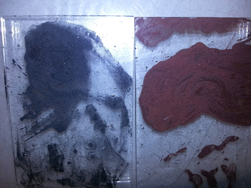


The chips actually worked quite well. They didn't fire to the smooth and glossy shine of my modern Resuche paints, but they were opaque and well-adhered. I suspected, still, that they would be poorly fixed so I took the chips to my lightbox and hit them with a skewer I use for cleanup work. None of it scratched off.

The iron chip is "psychologically black" rather than optically black; When you see it, you know it's black. Your brain would remember it as black. It's actually fairly grey. The copper based pigment is a pretty color, but I would best describe it as somewhat like dried blood; It's lighter than bistre brown (which reminds me of old tree bark, it's a very dark color but not enough to be perceived as black) and it's a bit darker and more true than tracing brown, which to me has a reddish hint.

Overall, it was incredibly exciting to get working results with these very first attempts. I'm going to pursue more period steps immediately.

As an afterthought, I want to document something Master Avery shared on Facebook. I was totally unaware that you can reverse rust back into iron. The physical structure is destroyed, but the iron is recoverable. This is one way to get good, fine, filings; By using an oxidizer (and I will edit in what he offered, bleach I think) you can get the iron to rust. Then you can easily grind the rust. Putting it in charcoal and heating it appropriately will reverse the oxidation and leave iron. Very, very neat.


Lessons Learned/New Questions:
Holy cow, this worked.
It would work better if ground up more finely
     Use commercial powder/better sieved home made powder?
     Try the porphyry method
Does da Pisa have a recipe? Mappae Clavicula? The Bolognese manuscript? Have to check them...
I did very tiny batches, next time use my sandblasting mask to avoid any invisible dust inhalation.
How is color modulated? How is my modern tracing black so much darker? More iron? Or a darker mineral?
What will hematite look like? Pinkish, for sure, but...
What is Byzantine blue glass? A color, or a specific formula of glass? Byzantium is a purple...

Sunday, September 27, 2015

Archery Tournament Trophy (A Day of Archery, 2015)

I decided to try working on my painting skills. I grabbed a tiny brush meant for painting minis, and built a small wooden bridge to rest my hand. I got to work:


 It's hard to tell how the lines are doing while tracing, at least for me. Once I removed the original image I was very, VERY pleased with the line work. It has a somewhat irregular, rustic feel but I was ok with that.

Matting, to remove highlights


Matting cleaned up


I'm particularly pleased with this leg. The knee was a great accident.


After silver staining. I also wanted to stain the rock at the archer's feet, for some kind of vertical balance, but I tried three times and it blended "away" from the line too much. I moved on without it.


The finished and framed piece, at the archery field.


Thursday, August 13, 2015

Pattern Shears

Going to try something new at my Laurel's suggestion to see if it makes me happier with my cutting accuracy. A lot of the super-precise artisans I've met online seem to use pattern shears, and she suggested it for me.

I hopped over to my local supplier and got a pair. The owner, an awesome woman, had me find them in a box under a cabinet because she hasn't had demand for them in years. The shears give a seriously big gap (and I triple checked they were foil, not lead not mosaic). For a few bucks I grabbed them anyway, but kept researching. I found shears that kept saying they removed 1/32" for foil. The pair I got locally can not be 1/32". I ordered a pair (made by Mika Intl, via Amazon, but this is not a plug). They DEFINITELY remove less pattern:

"Squeeze-bottle grip" foil scissors, left, Mika Intl shears, right.

I'm working on cutting up a pattern right now, planning on starting to cut it tonight. Lots of curves and difficult cuts, it should be a great test if this method works better for me than working "English" (glass on pattern on lightbox).


Sunday, August 9, 2015

Estelle's vigil: Family Badge Platter

Estelle did not ask for this, but some time ago we discussed the idea of making a matched set of platters that, when joined, would form her family badged (used by her whole mundane household). I decided this was as good a time as any!

The plates feature blue bars on a clear (white) field, with green in the corners (skipping heraldry terminology for non-heralds). Because I use a base layer of clear, I didn't see the need to fill in the second layer with clear. This is the first time I've tried any fused project with clear. I expected that the blue might spread or contract a bit, but I thought it would be acceptable:


HUGE bubble. Right beneath the base layer, not between two. The edge was also very irregular. ALSO, the grey sharpie used to tag the glass didn't burn off as I had expected. So, scrapped it and started over.


This time, I added clear layers in the top. The results fused much more smoothly:


And the slumping went well. Initially the shape bothered me, I thought I was seeing the "dogboning" problem I've had in the past with this mold, and I had been correcting my slumping temperature down to try and adjust. After a couple of days I realized they are fine; the molds have a slight curve in a plane I didn't realize, and the shape is closer to the mold's shape than I thought.


The piece in the top of these pictures had some old kiln wash fuse to the glass. For the immediate purposes, this is fine, but I plan to remake it so it has the clarity of the second (bottom) tray.

Lessons Learned:


  • Applied kiln wash apparently has a shelf-life!
  • Better results with even layer coverage.

Sunday, October 26, 2014

"Dogboning"

I enjoy making fused items, too. I made two plates for Their Majesties lunch at Fall Crown last weekend. I had an issue with the first one, and turned to the great people at Fused Glass Fanatics on Facebook.

The "not quite right" but serviceable plate, in the mold.

I was informed this is called "dog boning" and is the result of firing either too quickly or to too hot a temperature. After giving my firing schedule I was told the pre-set schedule I've been using goes about 100°, maybe 150°, too hot. I'm very glad to know this, and to know there is a term for it!

Monday, September 15, 2014

ODH Scroll for Baroness Zafirah

I describe myself as the worst scribe in the Midrealm. Frankly, I don't self-identify as a scribe at all. I don't work on any kind of C&I in my free time or for enjoyment. I started taking scroll assignments in my capacity as a herald to assist the scribes when a court list came out on short notice or was larger than normal. I've made 3 or 4 paper scrolls, unhappy with any of them, before deciding that I should try and make a glass scroll and play to a strength while getting the job done.

Still, I never take assignments above the AoA level, I leave those for the practicing scribes. So when Estelle, my good friend and our chief Signet messaged me on Facebook offering a Dragon's Heart assignment I balked. Twice. She was insistent, I'd really want this one. I finally agreed and was not disappointed. But that left me needing to figure out how to make a scroll worthy of our highest service award beneath a peerage, one going to another dear friend.

I started sketching ideas on my train ride and sent her a picture. She immediately liked one of the designs so I worked on making it into a full cartoon.

It can save a lot of frustration to make the most difficult cuts first, so I started on the heart. Slowly removed the "dip" in tiny cuts until I didn't dare press my luck further:


I painted on the lines with some fear. I've made one other Dragon's Heart (a suncatcher, not a scroll) and the green glass turned from a translucent Hunter's green to an opaque green with translucent mottled spots. I had one sheet of glass and it pretty much had to work for me to be done on time.


A sheet of lined paper from my previous scroll was sitting behind the lightbox, and it came in very handy with this. Once dry I did some stickwork to clean up the lines, and fired it overnight. I was intensely relieved when the glass came out looking as it had going in.

I was going to leave it alone there, as with the other heart, but I wanted to make it stand out more and thought of shading/highlighting schemes. I hastily mixed some paint, applied a mat, and tried several schemes for highlighting either the entire piece or the individual scales.


The left half is shading the entire heart (though not as gradually as I planned). The right half shows a stippled highlight, scrubbed highlight, a stickwork edge, and combinations.

I then decided this mat was a LOT heavier than I desired and redid it with something more like what I wanted in the "real" shading. My consulting scribe said she thought the scrubbed scale-by-scale highlight looked best so I did more of that on the test piece.


That being settled, I ground and remixed my paint better, and did the real thing. An observation about scrubbing is below.


The red and clear fill-in for the "inner circle" was easy and routine. I found a Spectrum Baroque sheet that had faint tan streaks and chose it for the calligraphy border for interest, rather than use more of the Foxtail sheet from the inner circle. This time I mixed up some water-based paint, after speaking with Kirsten about it, rather than the clove oil paint before. I tried the dip pen, but it fought me again. I finally tried a tiny brush from the local hobby shop, intended for painting Warhammer miniatures. I discovered that a pretty good technique could be gotten from it. A painting bridge was extremely important to this work. The calligraphy isn't great, but this time I've come away believing that with a bit of practice I could make some respectable lettering. The water-based paint made half the difference as well.

As always, click to see larger versions.


I was very unhappy with the way it looked foiled. The gaps were rather large. I suspect it's because I use photoshop to make my own patterns at times, and the lines are fuzzy. I think I'm sabotaging certain custom patterns right from the start by not having crisp cutting lines. I eventually quit trying to evenly space the pieces, and instead I pulled them closer to the center. This caused heavier lines and larger gaps between the heart and the calligraphy border, but at that point it looked symmetrical and pleasing to the eye, at least I felt so.

As the woman who taught me stained glass once remarked, "black [patina] hides all manner of sins" and once the roundel was completed I was much less upset with the finished product.


Lessons Learned
1) Water based paint
    After I made the Acorn scroll Kirsten mentioned she does her calligraphy with water-based paint for easier clean-up. I often remark that glass is a forgiving art for a shaky non-artist like myself because we can clean our lines up a fair bit. I don't have a before picture of the calligraphy for a reason, scribes would faint. I intend to use water-based paint to "calligle" going forward. I'm next going to try it with a "kistka" tool used in pysanky painting, another Kirsten recommendation.

2) Mixing from the edge.
    It's very difficult to keep a pallete of paint well-mixed with a tiny brush while writing. I found if I started aiming for the edge of the puddle it was easier. In this picture you can see the paint separating (It is my understanding the "grey" water is the gum arabic separating out). You'll notice the edges remain black. I started quickly mixing that small area when loading my brush. I can't be sure if this actually means I got very little gum into my paint, but I had no problems getting it to hold the glass until firing. 


3) Scrubbing
     I think I've remarked before that I love the look a hog bristle scrubber leaves on paint. There can be tiny lines left behind that look rather like a carved blockprint. It's an imperfection that is beautiful to me, and there are very few of those in this world. I started off using Q-tips to scrub out paint but that got messy. I switched to a bristle brush and enjoyed the look much better. The line between shading and highlighting is not as crisp and sharp but looks less amateurish to me. Unfortunately to get that effect I was very hard on the brushes, bending the bristles at the ferrule in a way you would never do a loved paintbrush.


4) Matting
     Paint does lighten-up by 20-25% after firing. The lighter matting paint I put down disappears in strong light. I took some pictures in my window, but direct light on a clear sunny day made the shading disappear totally. A cloudy day should show it as I intended, being similar to my lightbox. A darker mat (though not as dark as my first practice!) may have been better.