Monday, March 27, 2017

Two Mistakes: Hamsa

I had the idea to make a Hamsa. The idea persisted, and turned into a large flop. So, I remade it. Which turned into a second flop.

Enamels are difficult.

I ended up making nearly the same design, but pieced. I was mad and determined, at that point.  I started with a design I found online; I found it on several websites, in several ways and places. I couldn't determine an original creator, etc and chalked it up to a generic cultural motif. Having learned much from Estelle's scroll, I thought I planned it well. I used the more stable blue, and skipped the idea of using silver stain.

Attempt 1, I painted on the black line work, then added a mat of blue enamel. In the past, again for one of Estelle's badges, I got a phenomenal sapphire blue right off the bat. That gave me incorrect assumptions about how easy it can be to use!

This happened over a year ago, and Facebook isn't helping me work out the order. I know at one point I discovered I had two different blues on hand, with no recollection of the opaque one. So much so that I went back and found the order and made sure I had consciously ordered it (which I had).

The next piece, I kept adding blue trying to get the Sapphire hue I wanted. After a few coats the enamel turned opaque and off-color, a grayish tone to it. I still don't know why, but I decided I needed to get it right from the start.

The next attempt, after doing the line work and the enamel I decided I wanted to shade the background and went back, to add more black mat. That tanked the whole piece as well, as shown below.


Ugly and wrong color, above!


 My "mistake" in going back to vitreous paint. Guess blue enamel isn't as stable as I thought.


A closeup of the weirdness that ensued. I suppose too many layers of enamel flattened out and blurred the black lines beneath, like layers of glass can displace one another when fusing.

The final piece I successfully made and framed, to get a Hamsa out of my mind. I've not included a picture of the pattern to retain my blog's G-rating, as each piece was named with a different profanity, instead of the customary numbers or symbols.

The bottom right corner was 'bullsh*t' if I recall. It was easy to cut, that was just it's nickname.

Lessons Learned:


  • Be sure you are using the glass paint you think you are using!
  • Blue enamels are also touchy. All enamels are semi-evil.
  • Weird things can happen if you apply them too thickly (?) or fire them too many times
  • It looks like many layers can displace one another between firings.


Glass and Gold and Gilding

I've signed up for a couple of mosaic classes in April and May. It reminded me I wanted to try my hand at making Byzantine-style tesserae, and then a friend's Facebook post kicked me into high gear. She had much better success than I did and shared some of her wisdom. My test piece:

Two pieces of clear fusible (Bullseye CoE 90 Tekta clear) with one layer of gold foil sandwiched

Rhode Kephalaina let me know in her sample chips, marked 1 and 2, thats the sheets of foil. So, chip '1' has four layers approximately, and '2' with 8. My samples above are 4" square, not 1", and had one layer. It's not exactly ugly! It's just not the beautiful gold glass expected. The nicer parts of mine are where the foil doubled on itself (see Lessons learned, below...) I know now to fix it, though, thanks to a conversation with Rhode.

Ive also fallen for verre églomisé. Predating Rome, pretty much, this art (gilding glass and painting the back black) was practiced through the Roman period into modernity. It gets its name from an art collector 200 years named Glomy. It turns out it's not super difficult!


Sorry it's sideways. I can't quite remember how the technique entered my awareness, either through researching mosaics or mirroring. A little gelatin, some gold leaf, and some glass. A fine needle to scratch it up, and black paint. I'm going to teach a class on it at Pennsic this summer, which is exciting to me. I've tried a few types of leaf, a few tools to transfer it to the size, and will be picking up a second (larger) gilder's tip this week. It's beautiful to look at and I'm excited to see how I can integrate it into stained glass and mosaic work.

Probably To Be Continued...

Lessons Learned:

  • Transfer foil is a lot better to work with for verre églomisé.
  • Tiny creases are almost unavoidable with loose leaf, but the gelatin size flattens them out as it dries. The end result isn't perfect but it is much better than what you start with.
  • TURN OFF YOUR CEILING FAN. Many people remark that gilding can be done at your kitchen table, and they are quite right. But when you bought a book of loose gold leaf and have the fan on medium, you are going to make a kaleidoscope of tears and gold for a moment. 
  • Making Roman Gold, as Rhode is trying, or Byzantine Tesserae as I am, costs a bit! The leaf is not terribly cheap, though you can find it reasonably. She speculates gold foil, not leaf, would work better but it runs $75/5 sheets. 
  • Don't use imitation gold. I did this before a year or two ago, without entirely realizing. It was an aluminum-based product, I believe. It turned horrible colors and crinkled up under the glass. 
  • I wondered at using silver to do this. I'm told it can work, but my experience with silver stain says it certainly cannot. Ken Leap's book shows an example of firing a piece of solid leaf, and it made a dark amber stain at just slightly higher temperatures than I use to fuse. Further, I've used ground silver leaf in a period formula at much lower temperatures, and it made a light lemon yellow. I'd think 'silver' would necessarily be platinum leaf, which I have not priced or looked at.


Friday, February 3, 2017

Silver Stain Experiments Part 2

[Edit: No idea what this is still a draft. Publishing now, three years later!]

Phase 2 has actually turned up some successful blends!

Detailed below are tests I ran with pure silver, silver nitrate, copper sulfate, and silver sulfate as the active compounds. Binders included a new, "brand name" red ochre, yellow ochre, gum arabic, and brick dust. After doing a round of tests I came up with several new ideas, particularly where pure silver and copper sulfate are used, and had to do another set.

Some notes on the binders themselves:

Silver dust and gum arabic - Almost indistinguishable from pure silver dust. Film formed, gum arabic undoubtedly. Weird to see it plainly, but interesting to get a clear visual of the effects of gum arabic. I've noticed recently, when I added too much water to some matting paint, how there is a "thickness" to the water, as you stir the paint you can see some of the unmixed water jiggle and repel the paint until you force it to mix. I've not tried mixing paint with no gum arabic but I think I'll try it to confirm my thought that that is also the GA (rather than the paint). That may be what they refer to as "body" when talking about other binders mixed with water.

Brick dust - Probably needs to be even finer. Works well. I ground pot shards with a pestle and mortar, but I think I need to get it even finer. I'd love to get my hands on a ball mill to do this, but it's not in any shape period.

And a correction from "Part 1" in that I realized I'm slightly blind. As I began to tag and catalog my samples, I almost threw out a few pieces that didn't take. As I was getting ready to toss them I realized that the copper sulfate chip DID stain:

On two slides it's almost imperceptible (this picture above is not a very good example, but it shows up at least) but it was actually there. Because of this realization I tried a stronger mix of copper sulfate for this round. As detailed below in Sample 6 it didn't work out, but I have a good idea why not (temperature).


The stain samples prepared and drying:


A closer shot of the samples:


Silver nitrate and gum arabic made an incredibly pretty, deep orange color while drying. This continued to intensify as it dried, becoming a dark red


The samples after firing:

Sample 1 - Pure silver dust and gum arabic (1:6). Oddly enough, this did nothing. I suspect it takes a higher temperature to work. I know from Leap's book that pure silver leaf will leave a dark amber stain on glass, I can't imagine the powder not having the same effect. Later review of Leap's book indicated he fired his pure-silver tests at 1500°, a full 500° hotter than I did. I know what to try next, and may throw some more of sample 6 in with it.

Sample 2 - Silver nitrate and red ochre (this time from Vallejo pigments). Clear proof that there was an issue with the red ochre I bought before, this name brand sample didn't have the same hazy effect that the first sample left behind, ruining what results there might have been. Part of the sample is a little darker, but I suspect that may be related to how I used it (no blending, possibly imperfectly even surface allowing oxygen to get in, etc) rather than the mix. I consider this one a success!

Sample 3 - Silver nitrate and terracotta dust. A bit of research indicated most of the bricks before the 14th century would have been very similar to what we call terracotta. I bought a small planting pot, smashed it, and started grinding it into a powder. It seems to work quite well, actually. The one downside was that it must be ground very finely. Small "pinholes" are visible in the sample (close-up later in the post). This was caused by less well ground (larger) bits of the terracotta that inhibited the even spread of the silver nitrate. This also left behind a bit of hazing on the edge, but I again suspect it has to do with handling rather than the compound. I also consider this one a success.

Sample 4 - Silver nitrate and gum arabic. Oddly, this didn't work at all. No effect was left behind. Isenberg's book has a chapter on painting and a page on silver stain. It mentions that the "Reddish material" has minerals which pull the sodium out of the glass and allow the silver in. I find it hard to believe, but at the moment have no other explanation for this chip's complete lack of stain. The silver sulfate and copper sulfate chips, both mixed with gum arabic, had visible staining. Silver nitrate did not. The same book also states that "other silver salts" (presumably silver sulfate) are added to stain powders because nitrate is unpredictable and melts unevenly. I haven't seen that to be the case, yet, either.

Sample 5 - Silver nitrate and yellow ochre (vallejo). This mixture was twice as strong as the same combination I tested in "phase 1" and likewise is a much stronger color. This is 1 part silver nitrate to 3 parts ochre.

Sample 6 - Copper sulfate and gum arabic - This is a 1:6 strength mixture, better than what I had previously made. I discovered, just before pitching the last test chip, that copper sulfate actually had stained the glass. The compound was in such a small quantity that it was in the form of tiny specks. I mixed this more strongly and used more of it to try and get a more visible effect. I didn't get it, though again I got visible effects. I think this merits a higher temperature or longer soaking period.

Sample 7 - Silver dust and gum arabic, 1500°
Sample 8 - Silver foil pure, 1500°
Sample 9 - Copper sulfate and gum arabic, 1500°


A close-up of sample 5


 A close-up of sample 3


All 13 test chips I've fired so far

Lesson's Learned

Future Plans ("Phase 3")

Friday, April 1, 2016

The Arms of Baroness Laurencia of Carlisle, OL

Hello! It is a few minutes before midnight on the eve of Laurencia's elevation to the Order of the Laurel. I am scheduling this to go live early in the morning; I'll post it to Facebook mid-morning when it should be safe! Let me apologize in advance for the inevitable spelling and title screw-ups! Also please note you can click on pictures to enlarge most of them. -Brynn


I used to work with Laurencia and her husband, Eirikr inn havi four or so years ago. A few months ago he messaged me on Facebook to ask if I could do her device for her upcoming elevation.


The original image he provided


Knowing her elevation was to be at Ice Dragon in April, I sat it on it for bit. Too long, but ok in the end! I seem to recall being told Laurencia is part of the "14th century mafia" so I wanted to pick a design that was appropriate to her period. Looking at extant panels from France and England, I found several of an armiger's device set in "plain glazing" or a window of clear glass. Frequently we do quarries with more acutely angled points, diamonds like the suit on playing cards.


Like these! Image courtesy of the CVMA


In several windows of this time, however, I saw they were the 90-degree style diamonds. The more acute style seems much more prevalent in late-period windows, I'd like to dig into those changes sometime.

At one point I thought about setting her device in a ring of laurel leaves, but I found it very difficult to do so within a reasonably-sized window. I tried scaling my pattern up from 12 to 14 to 16 inches square, but I couldn't find proportions that were acceptable. Either the ring was too thin, or the device too small, or the combination awkwardly placed in the pattern. I eventually dropped that plan and just focused on her device.

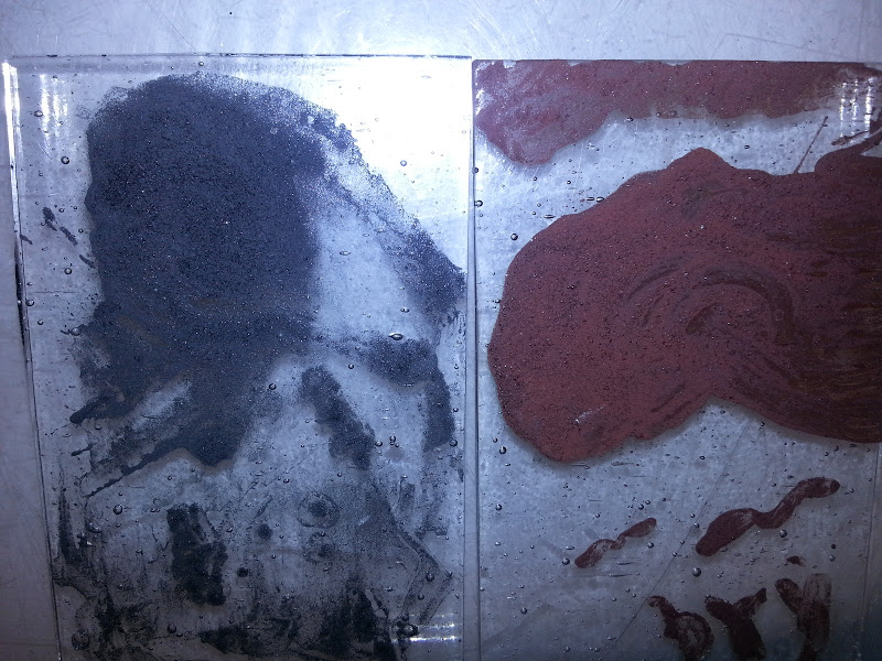
I opted to used all mouthblown ("Handmade") glass for this. On hand I had sheets of Krosno (from Poland) and St. Just (from France). I had never mixed them, so this was the first opportunity I had to note the difference in their compositions:


The edge-on view gives it away. The green is caused by iron impurities, though a few sources claim some copper content can do that as well. Ensuring the iron is kept out, or adding selenium or lead, causes a clearer glass as with the other brand here. If I'm not mistaken, it's the St Just that is green.

The flashed glass I used, red flashed on clear, is of unknown provenance via THL Molly Sotherden, but despite hearing of it's existence I've yet to find machine-rolled flashed glass. Looking at the irregularities, I feel very confident it is mouthblown as well. I learned during this project that flashed glass can be a striking color (See Lessons Learned section below). Flashed glass has a thicker base layer of one color (usually clear) and a thinner layer of another. It is one solid sheet of glass with two distinct sides. Originally this was done because otherwise some colors were too dark to transmit light (red is the best example). A sheet made in the typical way would appear black. Giving a thin layer of color to a clear sheet allowed the red to shine through and remain strong enough to use. In the 14th century it became well-known that you could remove the colored layer and add extra detail without adding leadlines.

At this point in time, most glass cutting is done with a dividing iron (a red hot poker used to incite thermal shock in the glass to give it a crude shape), which can be seen in my post here and the video to which it links. The shape would be refined through a grozing iron (I now use a proper grozing iron made for me by THL Kendrick Cameron, but my original one can be seen here). About this period in time, diamond-tipped cutting tools are becoming known in Italy. I own an antique diamond-tipped cutter and used it a little for this project; unfortunately it is rather temperamental and I wasted half a sheet of clear glass trying to make it work. As a result the majority of the cuts use a modern carbide-wheel cutter to save glass/money.


My modern cutter, and my antique diamond-tipped cutter

Period sources talk of either abrading away the flashed side, or using acid to etch it away. The acid called for in period is generally not strong enough to etch glass unless it is of very poor quality (and hat tip to my Laurel, Mistress Kirsten Thorsteinsdottir, for that fact). Modernly we can use a stronger acid, power tools, hand abrading, or sandblasting. Sandblasting and acid end up with very similar results. Having tried all of these options in the past, and wanting a certain "hand abraded" look on "power tool" time tables, I abraded it using an engraving tool. It is less drastic than a dremel, and after firing I think it looks excellent.


The water bath is probably not period, but we prefer to avoid death by silicosis today! The picture on right is the piece before fire polishing.

I applied vitreous paint to the bird using a miniver brush, as called for in our primary source texts. Period formulas for vitreous paint call for crushed glass and mineral/metal oxides for color. Modern texts reference using glass fluxes and components, rather than actual glass, for making paint, however the oxides are still in use. I fired the three pieces, bird and two halves of the ermine section, in my modern electric kiln. My tests on proper period kilns are still forthcoming and, again, the glass is expensive to waste!


The central/bottom portion, after firing


The entire device, fired. I aligned the ermine spots to coincide with the lead line to try and mask it a little. Fully period cutting tools might have been able to get that steep inner angle cut out of one piece of glass. Might.

I cut the background of quarries and got stuck worrying about the next steps. Obviously lead came would be the period technique, and cast cames at that. I would have to use purchased milled cames, but my skillset with came is very rusty, and it's not as strong. In order to have a strong, lower-maintenance, and better looking end product I opted to use modern copper foil methods to assemble the window. That would be the biggest concession to modernity but I feel it was/is the right call.


The glass, all cut.


The glass, all foiled!


A pretty close-up 


The completed and framed panel

I put the completed panel in a wooden frame, which is called for in our primary sources. I added modern hanging hardware (eyelets and rustic copper chain) for Laurencia and Eirik's convenience. I hope that it arrived unbroken and that it is only one of many beautiful things she gets on the day of her elevation!


Lessons Learned


1) Diamond-tipped cutters are finicky!

2) From a discussion with Conor O'Ceallaigh, after fire polishing some non-yellowing lacquer could smooth out the texture further. I had several kinds on hand, but I wanted the abraded texture to remain.

3) I need more practice with framing stock. These pieces fit fine when I cut and test fit them, and held while I handled them after gluing. When I added the support brackets on the back, the joints popped a bit and gaps appear. OI!

4) This is only the second time I had an issue with a glass color striking on me, and the first was understandable as it was a green enamel. My sheet of red flashed was in two pieces; I knew one end was a prettier red and the other end was an odd brownish-purple color. I couldn't find the larger sheet with the better end, only a significant piece from the brownish-purple side. Remembering a funny story involving this piece two years ago (which I only told on Facebook, I'll add it here later today), I checked it against two different light sources. Sure enough, backlit by an incandescent bulb, it was beautiful ruby. Against fluorescent or sunlight, purple-brown.

Color being what it is between devices and cameras, this is the best I could do.

Since yellow light turns it ruby, I thought I could hit it with some silver stain to bring yellow into the mix, and have a piece that was actually red. I fired a test chip and when I pulled it out of the kiln, I was shocked to discover I couldn't see where the stain was. I was a bit disheartened and considered plans B (enamel) and C (piecing it together). Then I realized I couldn't tell where the stain was on my test chip because the entire piece had turned ruby.

This is actually the unfired piece from the picture above lit by a different lightbulb, but this is how the finished piece looks in all light as you can see in all the other pictures.

That was fascinating and a surprise!

Sunday, March 27, 2016

Archery Prize: Pheons

Details to come shortly! An educational lesson with Molly that churned out the first of a few archery prizes:


Monday, February 15, 2016

Period Vitreous Paints, pt 1: Oops, this worked?

"...using for this ground scales of iron and of another rust found in iron pits, which is red, or else hard red haematitefinely ground, and with these pigments he shades the flesh, using alternately black and red, according to need." - Vasari (Dover translation p. 269)

"...and he gives you a color which he makes from well-ground copper filings;" -Cennini (Dover translation p. 111)

"Take copper that has been beaten thin and burn it in a small iron pan, until it has all fallen into a powder. Then take pieces of green glass and Byzantine blue glass and grind them separately between porphyry stones. Mix these three together in such a waythat there is one third of [copper] powder, one third of green, and one third of blue. Then grind them on the same stone very carefully with wine or urine, put them in an iron or lead pot, and with the greatest care paint the glass following the lines on the board." - Theophilus (Dover translation, p, 63)

Since I've made all but one of the period silver stain formulas I have found, I've decided to try and make vitreous paint. I started by building a frit smasher; it's not the period way to grind glass but it is infinitely easier for some initial tests.

Vasari seems to suggest you just paint with metal dust. Cennini is less specific, but doesn't contradict that. Theophilus clarifies a mixture of metal filings and glass, one part to two..

Just as with my silver stain tests, where I started off with purchased silver salts, I used my frit smasher (aka a frit piston) to smash pieces of scrap clear glass from my scrap buckets. I originally thought that this would require making paints from the same glass you are going to paint on, but nothing in the primary sources suggests that. I've seen reference that say modern vitreous paints are more "glass fluxes" and oxides, rather than actual glass; the latter would seem to be more akin to an enamel as we define it modernly. In this case I specifically sought out pieces from at least two different original sheets to avoid accidentally lining up CoEs.

Scrap glass pieces. I ended up using about twice this. My left hand for scale.

After just a few minutes work, with occasionally shaking of the pile to mix it up for better smashing

For those who don't do much with warm or hot glass, the Coefficient of Expansion relates to how quickly the warming or cooling glass expands or contracts. If you try to use two pieces of glass with incompatible CoEs, they will separate, usually fatally and sometimes explosively. I've generally seen a safe range being only one point in either direction (the common CoEs are 90 and 96 for fusible glass, with 103 also being common to lampworkers making beads. Borosilicate glass/Pyrex used by some lampworkers is CoE 33.) The bulbs I use for my ornaments class are COE 89; we use CoE 90 frit with them with no problem, but 96 is right out.

I rather expected the CoE would be a problem, and would spall or destroy the test chip. I used my frit smasher and generated a mess of pebbles and dust. Lacking anything more specific for filtering, I rolled the material in a piece of cheesecloth to get a grainy powder into a bowl.

Do not inhale this!

I ended up with a wooden bowl of rough clear glass powder. I turned to two purchased bags of metal filings, one iron and one copper. Bother are already a very very fine powder. I scooped a little of each into small wooden bowls using a palette knife, and added a similar amount of glass powder. As I stirred I worried there wouldn't be enough glass to "bind" the metal, and I added more of my clear powder. I ended up, accidentally, with approximately the ratio Theophilus called for. I did some cursory grinding on the palette, but it really didn't help. Testing it with a sable brush showed poor adhesion to the hairs, and the paint that left the brush was fairly poor, very weak with the copper-based batch. The iron batch was much better. As both metals are finely powdered I think I found a better portion of the powder bowl to draw from by luck.

Next go around, I will try to grind them up on porphyry, as period sources call for. I have been confused from time to time on what that means. Over Facebook THL Ian the Green gave me some clearer details from C&I pigment creation. He referenced this video, suggesting the technique at 6:29 and after 8:00 would be helpful. I will try and follow these next.

I placed them on some of my standard test chips, cut to size a binder full of test chips. Because it is glass powder and metal, I suspected that it would require a fairly high temperature to fire these paints; period sources definitely don't have the precise control we have, and in theory this strikes me as much more akin to glass fusing than normal paint firing. I used my standard cycle (which reaches 1250) and waited. And waited. And WAAAAITED.


The chips actually worked quite well. They didn't fire to the smooth and glossy shine of my modern Resuche paints, but they were opaque and well-adhered. I suspected, still, that they would be poorly fixed so I took the chips to my lightbox and hit them with a skewer I use for cleanup work. None of it scratched off.

The iron chip is "psychologically black" rather than optically black; When you see it, you know it's black. Your brain would remember it as black. It's actually fairly grey. The copper based pigment is a pretty color, but I would best describe it as somewhat like dried blood; It's lighter than bistre brown (which reminds me of old tree bark, it's a very dark color but not enough to be perceived as black) and it's a bit darker and more true than tracing brown, which to me has a reddish hint.

Overall, it was incredibly exciting to get working results with these very first attempts. I'm going to pursue more period steps immediately.

As an afterthought, I want to document something Master Avery shared on Facebook. I was totally unaware that you can reverse rust back into iron. The physical structure is destroyed, but the iron is recoverable. This is one way to get good, fine, filings; By using an oxidizer (and I will edit in what he offered, bleach I think) you can get the iron to rust. Then you can easily grind the rust. Putting it in charcoal and heating it appropriately will reverse the oxidation and leave iron. Very, very neat.


Lessons Learned/New Questions:
Holy cow, this worked.
It would work better if ground up more finely
     Use commercial powder/better sieved home made powder?
     Try the porphyry method
Does da Pisa have a recipe? Mappae Clavicula? The Bolognese manuscript? Have to check them...
I did very tiny batches, next time use my sandblasting mask to avoid any invisible dust inhalation.
How is color modulated? How is my modern tracing black so much darker? More iron? Or a darker mineral?
What will hematite look like? Pinkish, for sure, but...
What is Byzantine blue glass? A color, or a specific formula of glass? Byzantium is a purple...

Sunday, September 27, 2015

Archery Tournament Trophy (A Day of Archery, 2015)

I decided to try working on my painting skills. I grabbed a tiny brush meant for painting minis, and built a small wooden bridge to rest my hand. I got to work:


 It's hard to tell how the lines are doing while tracing, at least for me. Once I removed the original image I was very, VERY pleased with the line work. It has a somewhat irregular, rustic feel but I was ok with that.

Matting, to remove highlights


Matting cleaned up


I'm particularly pleased with this leg. The knee was a great accident.


After silver staining. I also wanted to stain the rock at the archer's feet, for some kind of vertical balance, but I tried three times and it blended "away" from the line too much. I moved on without it.


The finished and framed piece, at the archery field.